
Kin Bakeshop
A two-hour line. A website stuck in 2019. One of them needed to change.
Promotional Design
Web Design
Brand Identity
Role
Sole Designer
Timeline
January 2026
Tools
Figma
The Problem
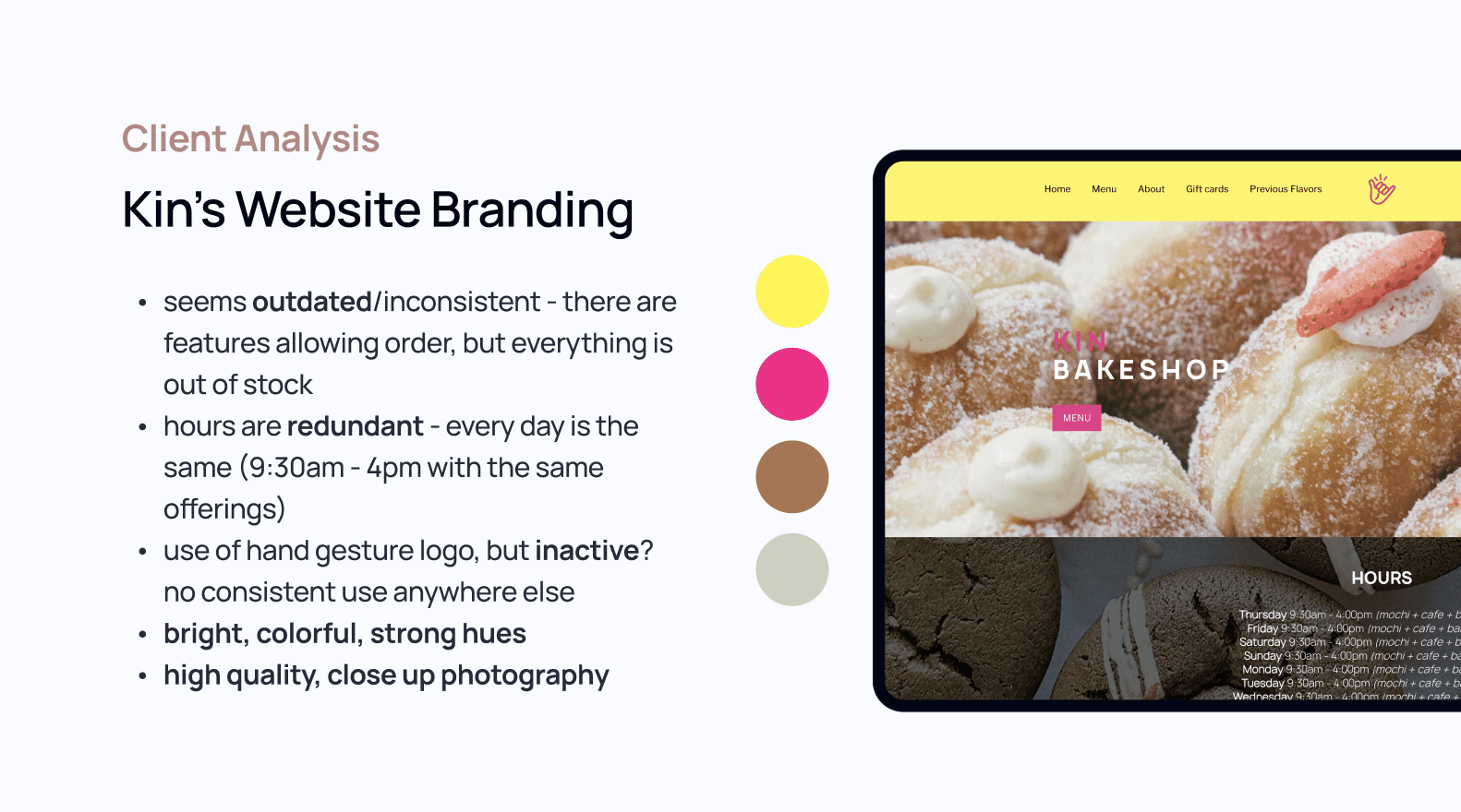
The website tells a completely different story. The color scheme (bright pink and neon yellow) had nothing to do with the warm, muted aesthetic Kin had grown into. More critically, the UX was actively misleading: a preorder button for a service they no longer offer, a user login and shopping cart (remnants of that same abandoned system), and both a "Menu" and a "Previous Flavors" page (when the menu rotates weekly and is by far the more relevant of the two.) For a business operating at Kin's level, the gap between the in-person experience and the digital one was significant.
What I did, and Why
I used the launch of the Evening Table, Kin's new night window service, as a natural entry point for the redesign, anchoring the hero section around this new offering to immediately signal that the site is current.
The bigger work was in the navigation. My guiding principle was simple: only show users what's actually true and useful right now. That meant removing the preorder flow entirely, cutting the login and cart, and reconsidering the page hierarchy. A menu that changes every week is a reason to visit the site regularly, and it deserved prominence. A static archive of previous flavors, while charming, didn't need its own page competing for the same real estate.
The visual direction took from Kin's current identity: warm, muted, café-intimate, moving away from the website's bright, neon energy. I truly wanted to emulate the feeling of being there with friends and family on a Sunday morning.
Impact & Takeaways
Sometimes the most meaningful design work isn't a rebrand, it's closing the gap between what something is and how it presents itself. Throughout this project, I particularly learned to put myself in the shoes of a user and dissect what features and aspects were needed and what were not. In the end, I found that while Kin certainly doesn't need a new identity (their hour-long lines say that for them!), but they might need their website to catch up with their current brand.