
Office of the Student Advocate
How do you build an identity for an organization people don't know they need?
Brand Identity
Social Media
Public Relations

Role
Director of Public Relations
Team
Director of External Staff
Director of Internal Staff
Student Advocate General
Director of Public Relations
Director of Student Life
Timeline
August 2024 - July 2025
Tools
Figma
Canva
The Problem
When I started, OSA had around 300 Instagram followers, which was well below the ~1,000 typical for organizations of similar scope. They posted infrequently, and when they did, the visuals were inconsistent. But the challenge my Director of External Staff kept articulating to me was deeper than aesthetics: people don't know what we do, and they don't know how much power we hold. OSA needed to present itself not just as a casework resource, but as a significant, credible organization on campus - one worth following before you ever need it.
What I did, and Why
I built a visual identity from scratch: a color palette developed collaboratively through reference and iteration, a defined typographic hierarchy, and a consistent posting schedule that made the account feel active and trustworthy.
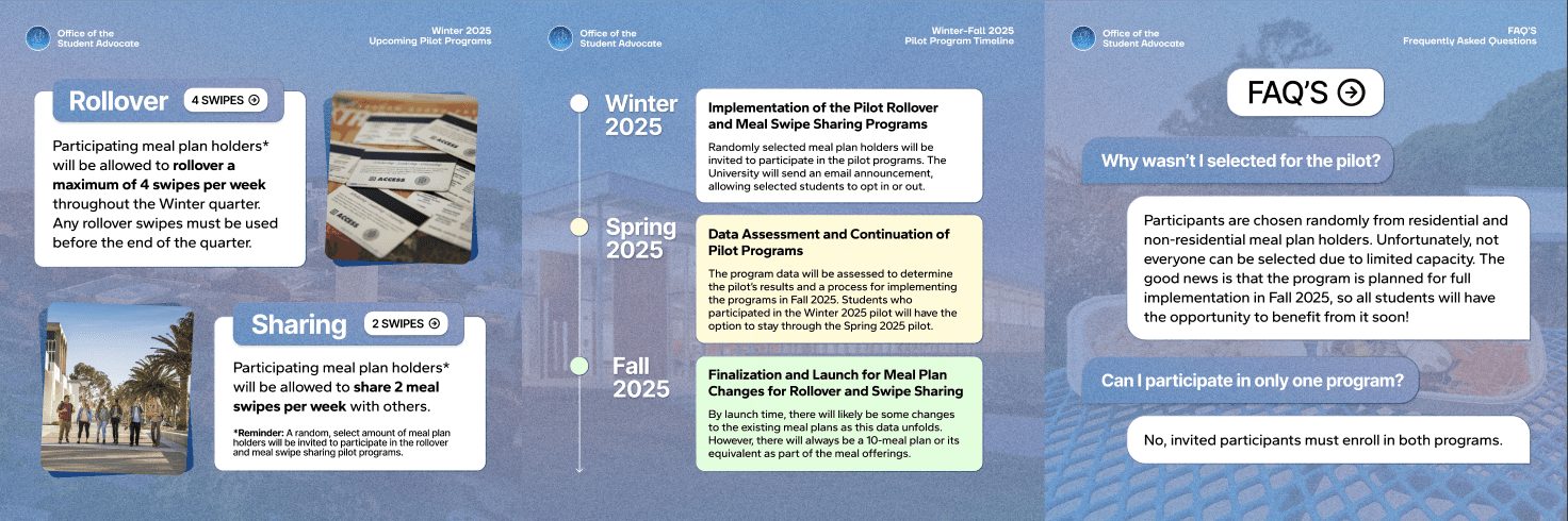
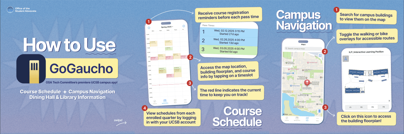
But the more interesting design challenge was figuring out what to say. I had to balance two distinct modes of content: organizational visibility (who we are, what we do) and genuine usefulness (information students actually care about). The posts that performed best were the ones that delivered real value: a breakdown of changes to the UCSB Dining Hall meal plan system, sourced directly from the Student Advocate General, which generated strong engagement and curiosity about what else we had to report. A "How to Use GoGaucho" post highlighting features our own tech committee had worked on. An AI panel Q&A addressing student fears about academic integrity and AI detection: timely, specific, and exactly what the audience needed.
Impact & Takeaways
147%
increase in Instagram followers
55+
design assets produced
Established a complete visual identity system (palette, typography, content schedule) that the incoming Director of PR carried forward after my departure
High-performing content included the Dining Plan update, GoGaucho feature walkthrough, and the AI academic integrity panel
Seeing the new director continue using the same visual system confirmed the goal: build something long-lasting and transferable for the organization, not just personal. The content strategy also taught me that the best post is often the one that answers a question students didn't know they could ask you.


